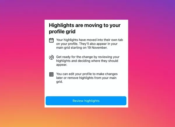
Instagram has recently announced a significant change to its user interface that could alter the way profile information is presented. This change comes in the wake of user feedback and a desire to streamline the visual presentation of content. With the social media platform’s focus on enhancing user experience, the decision to relocate Story highlights bubbles from their traditional position above the profile grid into a newly dedicated tab is set to take effect soon. While the details around this transition are still emerging, it has ignited conversations among users and social media experts alike.
The head of Instagram, Adam Mosseri, outlined the thinking behind this change by emphasizing the need for a cleaner, more organized profile layout. As social media continues to evolve, so do the expectations users hold for interface functionality. In this case, Instagram appears to be tackling the clutter that can often surround user profiles. By moving the Story highlights—often referred to as “pogs” within the platform—into their own area, Instagram aims to streamline what users encounter without overwhelming them with visual information. This reorganization underscores a broader trend in digital design, where simplicity often triumphs over complexity.
Many users have found themselves overwhelmed by the amount of information stacked crammed into Instagram profiles. The existing design, which included a circular highlight representation, led to a somewhat chaotic feel. By positioning these highlights in a tab that is accessible but not front-and-center, Instagram is catering to a more minimalist approach. Additionally, the introduction of vertically aligned thumbnail images for individual highlight topics may provide users with a clearer and more curated visual experience.
Despite the seemingly positive aspects of this change, there are concerns regarding user engagement with the new layout. Historically, the placement of Story highlights directly above the profile grid has facilitated easy access and interaction. This accessibility allowed followers and potential new admirers to quickly tap into a user’s unique stories. By moving these highlights away from this prime position, there is a risk that they could become less visible and, as a result, receive less interaction.
It raises a pertinent question: Are users genuinely engaging with Story highlights in a way that merits their prominent placement? Mosseri’s comments display a thoughtful consideration of user habits, suggesting that perhaps many people are not interacting with highlights anyway. If this assumption is correct, the changes may indeed reflect what users desire by simplifying their viewing experience. However, from a practical standpoint, it could turn out to be a misstep if users find themselves overlooking highlights that previously captivated their attention.
As with any major update on social media platforms, reactions are varied. Some users express frustration at the potential loss of visibility for their carefully curated Story highlights. Others are excited at a chance for a more modern and less cluttered Instagram profile. In a world where social profiles serve not only as personal outlets but as marketing tools, user sentiment is essential in assessing the success or failure of this initiative.
Moving forward, Instagram’s decision to implement this change may set a precedent for how social media platforms view user engagement and interface design. In an era where consumer preferences constantly shift, platforms that prioritize simplicity tend to maintain user interest better. Therefore, while this transition might seem like a minor tweak, it sheds light on Instagram’s overarching strategy and aligns with broader discussions around digital design aesthetics.
As Instagram rolls out this new profile structure, it will be crucial to monitor its reception and functionality. The outcome of this shift may very well dictate future trends in social media design, reaffirming or challenging users’ engagement with features that have become integral to self-expression and communication.


Leave a Reply
You must be logged in to post a comment.